Poole Wordsmiths
This website was created as practice for making a business website in 2025. It provided me experience with designing a website using Figma, experimenting with creative designs and balancing the UI and UX.
Poole Wordsmiths is a fictional business I created to practice making a website for a business. It’s a business that would provide content writing services (for products such as websites and blogs) for clients located in the Poole area.
I wanted to make a website that’s creative, easy to use and built for conversions, allowing the user to learn about the business, view their services and contact them for a quote. This was my first website project since I developed this portfolio site.
I designed the site using Figma, though my design process wasn’t as refined during this time. Once I completed the design, I coded the site using HTML, CSS and Javascript.
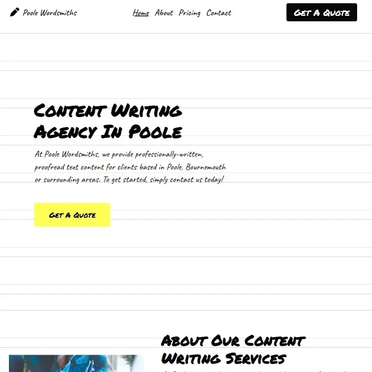
Whilst I do believe the final product is a user-friendly, visually-appealing website that completes all of its necessary tasks, it does look fairly bare bones and empty. However, one aspect of this site I still admire is the font and background choices that make it look like writing on paper. Not only does this match the theme of the site, it’s also a great way to make it more effective without sacrificing its usability.
I encountered some difficulties during the design process, as it wasn’t as refined as it is now. Firstly, I didn’t even bother with the components section as I didn’t deem it as necessary at the time. This made the prototype/hi-fi design part of the process a lot more tedious as I had to copy and paste the same components over and over again. Furthermore, I think I occasionally changed the padding of some of the buttons, meaning they aren’t even consistent. This was the project that made me recognise the importance of creating components.
Something else I found difficult was balancing the UI and UX, ensuring that working on one of them wouldn’t hurt the other. I originally tried implementing more creative animations, mimicking the text actually being hand written. However, the animations took too long and I felt like that could’ve been a UX issue. I initially struggled to find the balance, but I believe I’ve gotten a lot better at it ever since.
To improve this website, I’d definitely try to make the UI a lot less empty, especially on the about and service pages. Furthermore, I’d probably completely redo the services section, as I’m not a fan of the way it looks.
For more information about this project, please view the original website.