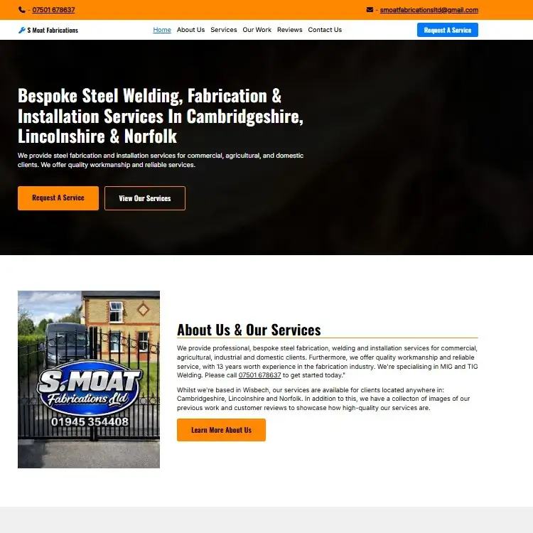
S Moat Fabrications (Home Page)
This website was created for an internship application assessment in May of 2026. It provided me experience with designing a website for a real business, conducting market research, meeting a brief and optimising the design for a target audience.
S Moat Fabrications is a company based in Wisbech that provides steel fabrication, installation and welding services for clients located in the Lincolnshire, Cambridgeshire and Norfolk areas. They wanted a business website to be developed for them that allowed users to learn more about their business, as well as request services directly online.
The assessment I was issued involved creating a home page mockup for their new website. It needed to display all of the necessary information, provide users with an easy way to contact the business and be tailor-made for the company’s respective target audience. Their Facebook and Google Business profiles were my main source of information for learning more about the company and determining what should be included within the website.
I designed the home page using Figma. The Figma file contained many design documents, including:
- The Project Brief - used to outline the goals and requirements for the website.
- The Sitemap - used to determine what pages and sections should be implemented.
- The User Flow Diagram - used to define how users interacted with each section.
- The Mood Board - used to give me a general idea of what colours, fonts and layouts should be implemented.
- The Content - used to ensure an easier wireframing process. I mainly used excerpts from their Facebook profile, as well as writing some myself based on the information.
- The Wireframes - used to provide general ideas of what the layout should look like and how it should change on mobile devices.
- The Foundations - used to ensure a consistent styling throughout the site, including its: colours, fonts, padding, borders and much more.
- The Components - used to ensure an easier designing process and to ensure that all components (buttons, links, etc) are consistent.
- The Hi-Fi Designs - used to prototype and finalise the designs, ensuring it’s ready to be coded.
Once I completed the design process, I moved on to code the home page using HTML, CSS and Javascript.
Overall, I’m fairly proud of this project. It looks modern and professional due to my choices of colours and fonts, and its use of effective headings, sufficient padding and simple layouts provide a friendly user experience. I’m confident that this UX-heavy design would’ve led to an increased conversion rate compared to some of the other applicants. Furthermore, the site was well optimised in terms of speed, accessibility and SEO, plus it scaled down very well on mobile devices.
I believe I created a very effective user journey with this website. The hero section immediately provides the user with helpful information and buttons without having to do any scrolling, and the sticky navigation menu also supplies useful links without scrolling. Afterwards, the user will learn more about the business and who their services are for, which is a great way of easily telling users if the business is for them. The use and appearance of headings here mean users can scan through the content to find what they’re looking for without having to read everything, which most users won’t have the patience for. Before the contact form, the user is provided with multiple trust signals (such as the portfolio and reviews) to further influence their decision to convert. I also added buttons that lead to the contact form in the services section for easier conversions. Alongside this, the footer provides many useful links that can act as a last chance to get a conversion.
To improve this website, I could’ve made the UI a little less plain in some instances. I generally try and not get too over-the-top with the UI as it can have a negative impact on the UX. However, in this instance, I might’ve made it slightly too plain in certain areas. Also, I should’ve made the images in the portfolio section a little smaller, and I could’ve added text on their hover overlay that provides a brief description of what the image shows, which would’ve been helpful for both UX and even potentially SEO.
For more information about this project and my process when designing and developing it, please view the website itself, as well as the accompanying Figma file.